
Details
Here's a full list of what's available in the Solid Shine UI library.
You're able to integrate what you need as you need it. You can build your whole program's UI using Solid Shine UI controls and windows, or you can just use the one or few controls or windows you need while still maintaining your existing UI. You can use Solid Shine UI alongside the standard WPF controls with no issues or changes in their behavior.
Windows
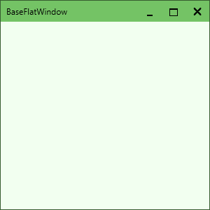
The FlatWindow is a window displayed in a flat sleek style, that looks and works the same no matter what version of Microsoft Windows you use. It can be easily dropped in to replace the standard WPF window, with no fuss or difficulties.
You can display custom controls in the top-right and top-left corners of the window — right next to the caption buttons and the title text — via the TopRightElement property. Use this to display a menu bar or a search box or whatever else your users may need quick access to. The FlatWindow, however, does not display an icon in the top-left of the window, and thus does not provide the functionality of closing the window by double-clicking the icon.
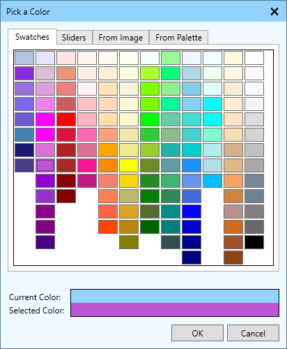
The ColorPickerDialog is a fully-featured color picker than be called upon at any time, and from which your users can easily select a color. They're immediately greeted with the Swatches screen, from which they can easily select a color from the large X11 color table. If they need precise control over the color they want, they can use the Sliders screen to select it, or they can select a color from an image or a palette file. Supports multiple palette formats such as Paint.NET, Gimp, and Photoshop ACO files.
The MessageDialog is a generic dialog that operates like the Windows MessageBox. It includes more customization options, such as: changing the text of the buttons, adding additional buttons, and displaying a checkbox for settings like "Remember this option". It also fits in visually with the rest of the library.
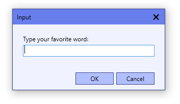
The StringInputDialog quickly and easily allows users to enter a string, similar to the input dialog JOptionPane from Java's Swing library. You can set the title and text prompt of the window, as well as pre-filling the text box with text as desired. A couple extra options are also added to aid with customizing the user experience.
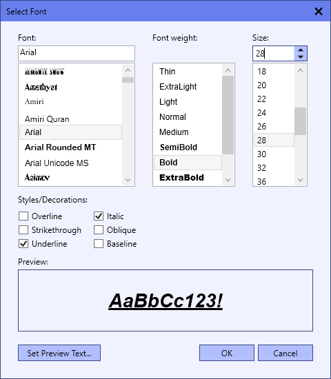
The FontSelectDialog operates similarly to the WinForms FontDialog, allowing the user to select a font, a font size, and other properties like font weight, and other styles and decorations. You can hide certain parts of the dialog you don't want the user to select (such as font styles or the font size). There's also a convenient preview box at the bottom to show the user how the result will look as well, with the ability to set the text to show in that box.
To make it even easier to use, you can use the included LoadFromControl and SetToControl functions to easily load or set the font properties of any WPF control.
And more:
- ThemedWindow: a standard WPF window, with the SsuiTheme property added in
- MultilineStringInputDialog: similar to the StringInputDialog, but allows users to include multiple lines of text
- LinearGradientEditorDialog: found in SolidShineUi.PropertyList.Dialogs, allows you to edit a LinearGradientBrush
- RadialGradientEditorDialog: found in SolidShineUi.PropertyList.Dialogs, allows you to edit a RadialGradientBrush
Fully-functional controls
In addition to the windows listed above, the library comes with the following controls:
- CheckBox: a box that can be checked; larger than standard WPF CheckBox for a more touch-friendly UI, and offers more customization
- ClickSelectTextBox: a TextBox, that automatically selects all the text within it when you click on it
- ContentControlWithMenu: display some UI elements on one side, and then a menu on the other side (or below)
- ContextMenu: a context menu with a flat, colored style to match the rest of the library
- EnumComboBox: a ComboBox pre-filled with the values of an enumerator
- FileSelect: select one or more files, via the Browse button or drag-and-drop
- FlatButton: a flat, colored button with a lot of customization options (including toggle-button functions)
- FlatRepeatButton: similar to the WPF RepeatButton, but with the appearance of the FlatButton
- DoubleSpinner: also known as a NumericUpDown; select a number by typing it in, clicking up or down, or entering a math expression
- IntegerSpinner: the same as the DoubleSpinner, but only allows integer values (and can display hex numbers)
- LinkTextBlock: a static hyperlink. Set it to open the URL you set it to, or handle its Click event and do whatever you need
- LongSpinner: the same as the IntegerSpinner, but stores numbers as a
long(for larger values) - Menu: a menu bar and menu with a flat, colored style
- MenuButton: a flat-styled button that opens a menu when you click on it
- ParticleEmitter: generate a bunch of 2-D particles for your app, to add some sparkles or motion
- PropertyList: view and edit the properties of any WPF control or C# object
- PositionSelect: select a 2-D coordinate between (0,0) and (1,1)
- SelectPanel: a powerful panel to easily manage a list and select items from it
- SplitButton: a button that can display content and also a menu with more options
- StringSpinner: a spinner that allows users to select a value from a list of strings
- TabControl: a flat-styled tab control, where each tab has a title, icon, and close button
- TimeSpinner: a spinner that allows users to enter in a time value (supports any TimeSpan value, or TimeOnly in .NET 6+)
WPF XAML Converters
SolidShineUi also includes a lot of WPF XAML converters. See the Value Converters page for the full list and how to use them.
Other classes
On top of the above, here are the other classes included with Solid Shine UI:
- ArithmeticParser: parse math expressions (
"(5+4)/2") quickly and easily. Available separately as well - AutoCompleteBehavior: adds basic auto-complete behavior to text boxes via attachable properties. Available separately as well
- BindableChild: allows you to use WPF binding for a control's Child property (such as Borders)
- BrushFactory: easy and quick creation of various brushes
- BrushSerializer: convert solid color or gradient brushes to a short string that can be stored or transferred (and then later deserialized)
- ColorPaletteFileReader: load a list of colors from various color palette file formats
- ColorScheme: a palette/scheme of colors to use throughout your UI. Generate a scheme from a single base color, or customize it piece-by-piece
- ColorsHelper: various methods for interacting with colors and color spaces
- ImageColorPicker: select colors from an image, used in the ColorPickerDialog
- IKeyAction: represents an action that can occur when a keyboard shortcut is pressed (such as CommandKeyAction and RoutedEventKeyAction)
- KeyboardShortcut: represents a single keyboard shortcut (and the action to take when it is pressed)
- KeyboardShortcutHandler: a helper class that can be added to any WPF window to add keyboard shortcut support
- KeyboardShortcutsIo: a helper class to load/save keyboard shortcut settings to/from a file
- KeyRegistry: represents a list of keyboard shortcuts currently set, and the actions to take when a shortcut is pressed
- SelectableCollection: an extension on ObservableCollection, with additional functions/properties for selecting items in the collection
- SelectableItem: a type of SelectableUserControl; a basic but powerful control to use to display items in a SelectPanel
- SelectableUserControl: the base class from which you can create your own controls to use with a SelectPanel
- SubKeyRegistry: when combined with a master KeyRegistry, allows you to create layers of keyboard shortcuts in more complex apps
- SsuiTheme: a scheme of colors and brushes to use with most SSUI controls (or your own controls that inherit from
ThemedControl) - SsuiAppTheme: a scheme of colors and brushes to use throughout your whole UI; has the ability to set an accent theme too
- SsuiThemes: a collection of pre-made SsuiAppTheme objects that you can quickly apply to your app
- TabItem: a tab to use with the TabControl
- TransformSerializer: convert a WPF Transform object to a short string that can be stored or transferred (and then later deserialized)
- WildcardMatch: match file names/paths (or any text) using wildcard characters like
*and?. Available separately as well
More coming soon
Additional controls, including Ribbon, will be coming soon! View the Roadmap for more details.
Documentation
For development documentation, including a full library reference, view the documentation Wiki on GitHub.